Great design is not created by accident. Behind every strong brand, website, and visual experience are design principles that guide how elements work together.
At DESAINZ, I use these principles in every project to make sure designs are not only visually appealing but also clear, balanced, and easy to understand for users.
Let’s walk through some of the key design principles that shape effective visual communication.
1. Unity
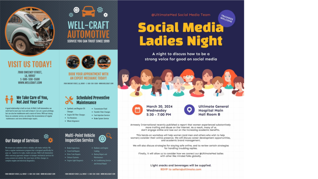
Unity is a design principle that brings all elements of a layout together to feel connected and harmonious.
Even when a design includes different sections, images, or content, unity ensures everything looks like it belongs to the same visual system. This is created through consistent colors, typography, shapes, spacing, and overall style.
In the example above, although there are two different designs, unity is achieved by:
- Using a consistent color scheme throughout each layout
- Repeating shapes such as circles, icons, and content blocks
- Keeping typography styles clear and organized
- Aligning elements in a structured grid
As a result, each design feels balanced and professional rather than messy or disconnected.
When unity is used effectively, designs feel polished, easy to understand, and visually pleasing.
2. Rhythm
Rhythm is a design principle that creates a sense of movement and flow by repeating elements throughout a layout.
Instead of feeling random, rhythm guides the viewer’s eye naturally from one section to the next. This is often achieved through repeating shapes, spacing, layouts, colors, or visual patterns.
In the example above, rhythm is created by:
- Repeating card layouts across the design
- Keeping consistent spacing between each section
- Using similar heading styles and content structure
- Aligning elements in an organized grid
Because of this repetition and structure, the viewer can easily scan the information from left to right and top to bottom without feeling overwhelmed.
When rhythm is used effectively, designs feel smooth, balanced, and easy to navigate.
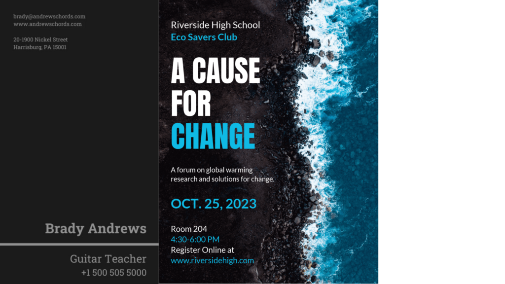
3. Emphasis
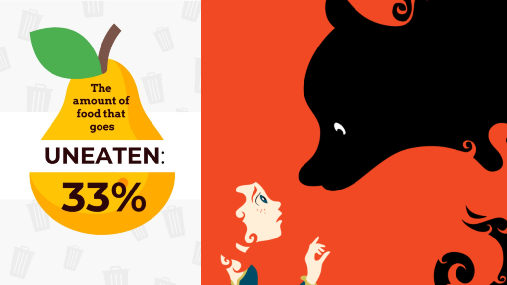
Emphasis is a design principle that draws attention to the most important part of a visual.
It helps guide the viewer’s eye to a key message or focal point using size, color, contrast, and placement. Not everything in a design should stand out equally. Emphasis ensures the main idea is seen first.
In the examples above, emphasis is created by:
- Using bold, large text for the “33%” statistic to highlight the key message
- Placing the main subject in the center of the layout
- Using strong color contrast to make important elements stand out
- Creating a clear focal point between the figure and the dark shape in the second image
As a result, viewers instantly understand what the design wants them to focus on.
When emphasis is used effectively, designs feel clear, powerful, and easy to understand rather than cluttered or confusing.
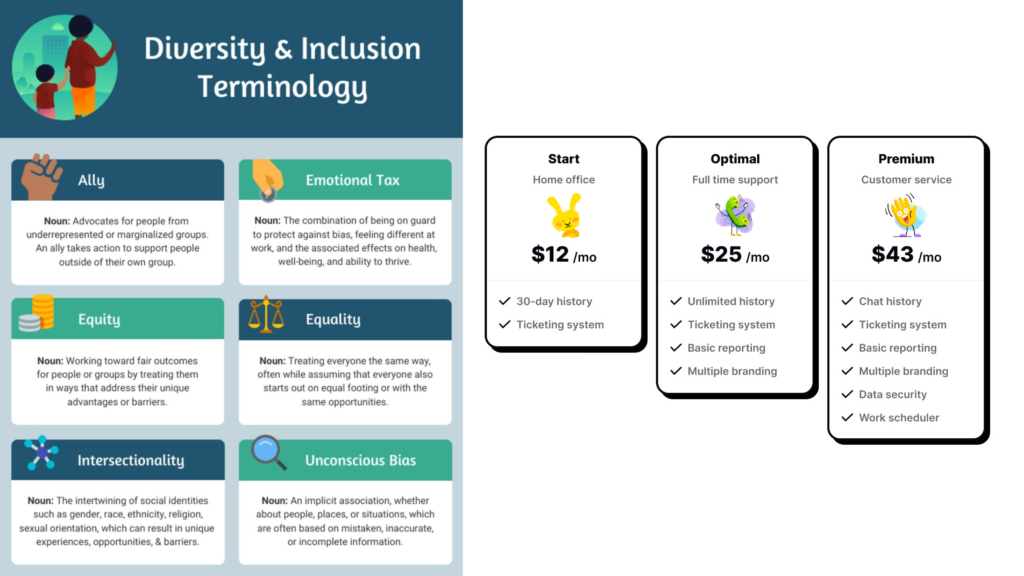
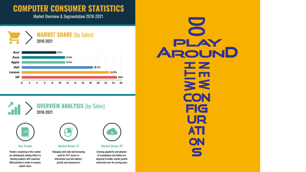
4. Contrast
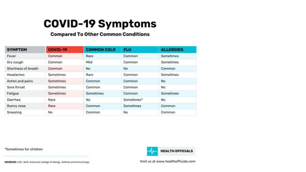
Contrast is a design principle that highlights differences between elements to improve clarity and visual interest.
It helps organize information, draw attention to important areas, and make content easier to read. Contrast can be created using color, size, typography, spacing, or layout structure.
In the example above, contrast is created by:
- Using different background colors for each column to separate categories
- Applying bold headings to clearly label each section
- Using light and dark tones to improve readability
- Highlighting key information so it stands out from the rest of the table
This makes it easy for viewers to compare information quickly without feeling confused or overwhelmed.
When contrast is used effectively, designs feel clean, organized, and user friendly.
5. Proximity

Proximity is a design principle that groups related elements close together to show their connection.
When information is placed near what it belongs to, viewers can quickly understand relationships between content. This helps layouts feel organized, clear, and easy to read.
In the examples above, proximity is created by:
- Placing charts and data labels close to their visuals in the report layout
- Grouping service icons with their descriptions in the landscaping flyer
- Separating different sections with space to avoid clutter
- Keeping headings close to the content they introduce
This makes each section easy to scan and understand without confusion.
When proximity is used effectively, designs feel structured, clean, and user friendly.
6. Repetition
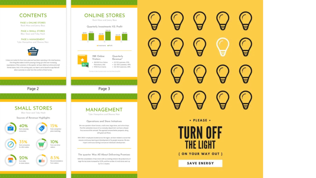
Repetition is a design principle that uses the same visual elements throughout a layout to create consistency and unity.
This can include repeating colors, shapes, icons, typography styles, or layout structures. Repetition helps designs feel organized, professional, and easy to follow.
In the examples above, repetition is created by:
- Repeating page layouts and section styles across the report pages
- Using the same color palette and typography throughout the design
- Repeating circular charts and icons to present data consistently
- Repeating light bulb icons in a structured pattern to create visual rhythm
These repeated elements make the designs feel connected and easy to scan.
When repetition is used effectively, designs feel cohesive, polished, and visually balanced.
7. Variety
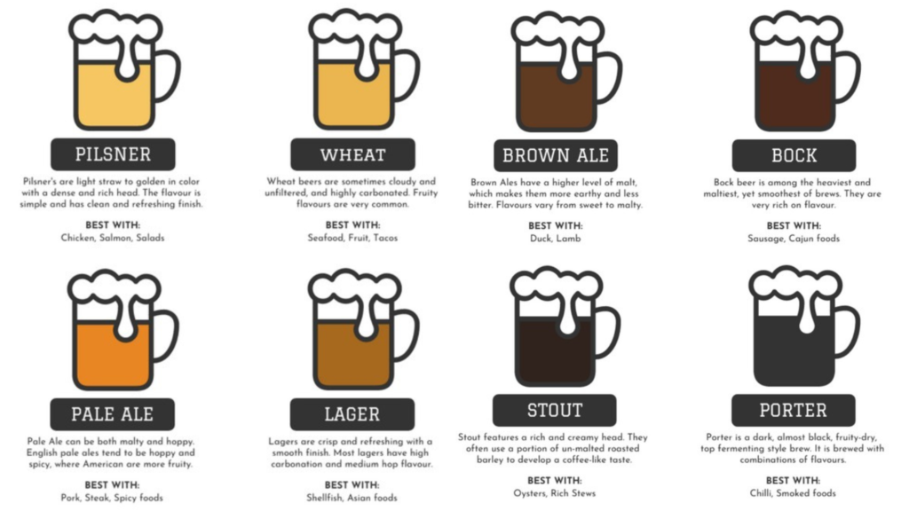
Variety is a design principle that adds visual interest by using different elements while keeping a consistent structure.
It prevents designs from feeling boring or repetitive and keeps viewers engaged. Variety can be created through color changes, different visuals, content variations, or subtle layout differences.
In the example above, variety is created by:
- Using different colors to represent each type of drink
- Changing labels and descriptions while keeping the same layout format
- Showing different visual styles within a consistent icon design
- Mixing light and dark tones to add depth and interest
Even though each section looks different, the repeated structure keeps everything organized and easy to follow.
When variety is used effectively, designs feel lively, engaging, and visually appealing without becoming messy.
8. Alignment
Alignment is a design principle that ensures elements are visually connected by lining them up in an organized way.
It creates order, structure, and a clean flow throughout a layout. When content is properly aligned, designs feel more professional and easier to read.
In the examples above, alignment is created by:
- Lining up charts, icons, headings, and text in clear columns and rows
- Keeping consistent spacing between sections
- Aligning visual elements to guide the viewer’s eye naturally down the page
- Structuring content so everything feels balanced and intentional
This organized alignment makes the information easy to scan and understand.
When alignment is used effectively, designs feel clean, polished, and visually connected rather than messy or random.
9. Proportion
Proportion is a design principle that focuses on the size relationship between different elements in a layout.
It helps create balance and visual interest by making some elements larger for importance and others smaller for supporting information. Good proportion guides the viewer’s eye naturally through a design.
In the examples above, proportion is created by:
- Using large headlines to grab attention first
- Balancing bold visuals with smaller text details
- Scaling images to dominate the layout while supporting content remains subtle
- Adjusting spacing so elements feel comfortable and well balanced
This clear difference in size helps viewers quickly understand what is most important in each design.
When proportion is used effectively, designs feel visually pleasing, organized, and easy to read.
10. White Space
White space, also known as negative space, is the empty space around design elements that helps create clarity and balance.
It does not have to be white. White space can be any background color, image, or texture as long as it gives content room to breathe.
White space improves readability, highlights important content, and prevents layouts from feeling crowded.
In the examples above, white space is created by:
- Leaving open areas around text to make it easier to read
- Separating sections clearly so information doesn’t feel cluttered
- Using background space to draw attention to key messages
- Allowing images and headlines to stand out naturally
The dark and blue backgrounds still function as white space by giving space around content.
When white space is used effectively, designs feel clean, modern, and well organized.
11. Hierarchy
Hierarchy is a design principle that organizes content by importance, guiding viewers on what to look at first, second, and next.
It is created through differences in size, color, contrast, placement, and typography. Strong hierarchy makes designs easier to understand and more visually engaging.
In the examples above, hierarchy is created by:
- Using large, bold headlines to grab attention first
- Placing key messages in the center or top of the layout
- Making supporting text smaller and less bold
- Using visual elements and spacing to separate sections clearly
This structure helps viewers naturally move through the content without feeling confused.
When hierarchy is used effectively, designs feel organized, clear, and easy to follow.
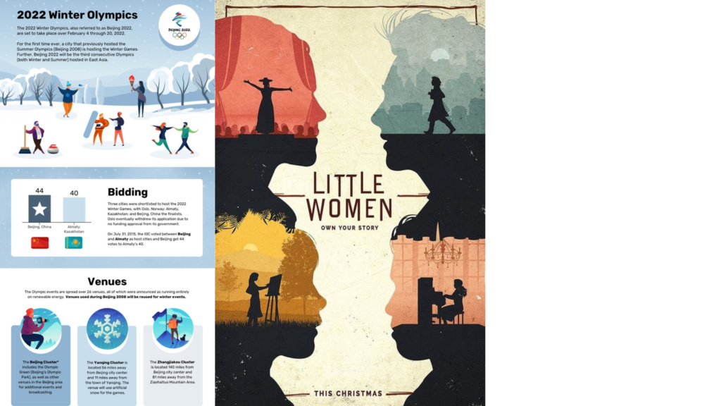
12. Movement
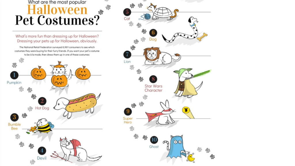
Movement is a design principle that guides the viewer’s eye through a layout in a natural and engaging way.
It doesn’t mean elements are actually moving. Instead, designers use lines, shapes, patterns, direction, and visual flow to lead attention from one part of the design to another.
In the example above, movement is created by:
- Arranging characters along a flowing path across the page
- Using footprints and lines to guide the eye from one costume to the next
- Placing elements in a sequence that encourages scanning
- Creating directional visual cues that move the viewer naturally through the content
This makes the design feel dynamic and fun while still easy to follow.
When movement is used effectively, designs feel engaging and help tell a visual story.
13. Balance
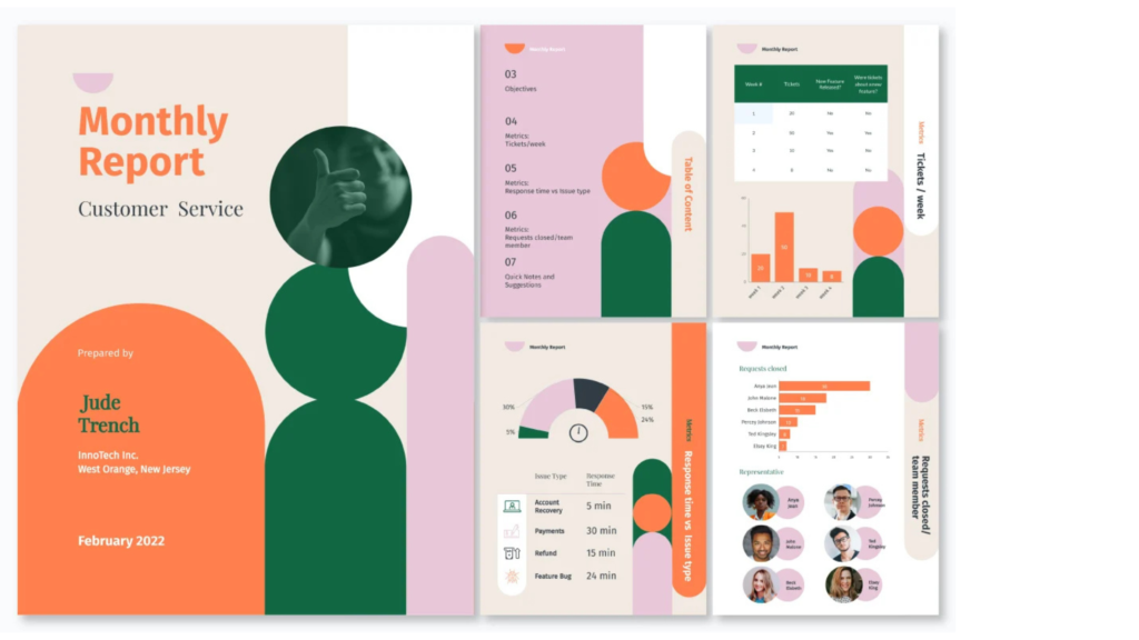
Balance is a design principle that creates visual stability by evenly distributing elements across a layout.
It helps designs feel comfortable to look at, organized, and not too heavy on one side. Balance can be symmetrical (both sides similar) or asymmetrical (different elements arranged to still feel equal in visual weight).
In the example above, balance is created by:
- Spreading content evenly across multiple sections and pages
- Using shapes, text, and images to counterbalance each other
- Keeping consistent spacing so no area feels overcrowded
- Placing large elements alongside smaller ones to maintain harmony
This balanced layout makes the design feel stable while still visually interesting.
When balance is used effectively, designs feel calm, professional, and easy to follow.